No time to read? It's an "input" problem
July 3, 2025
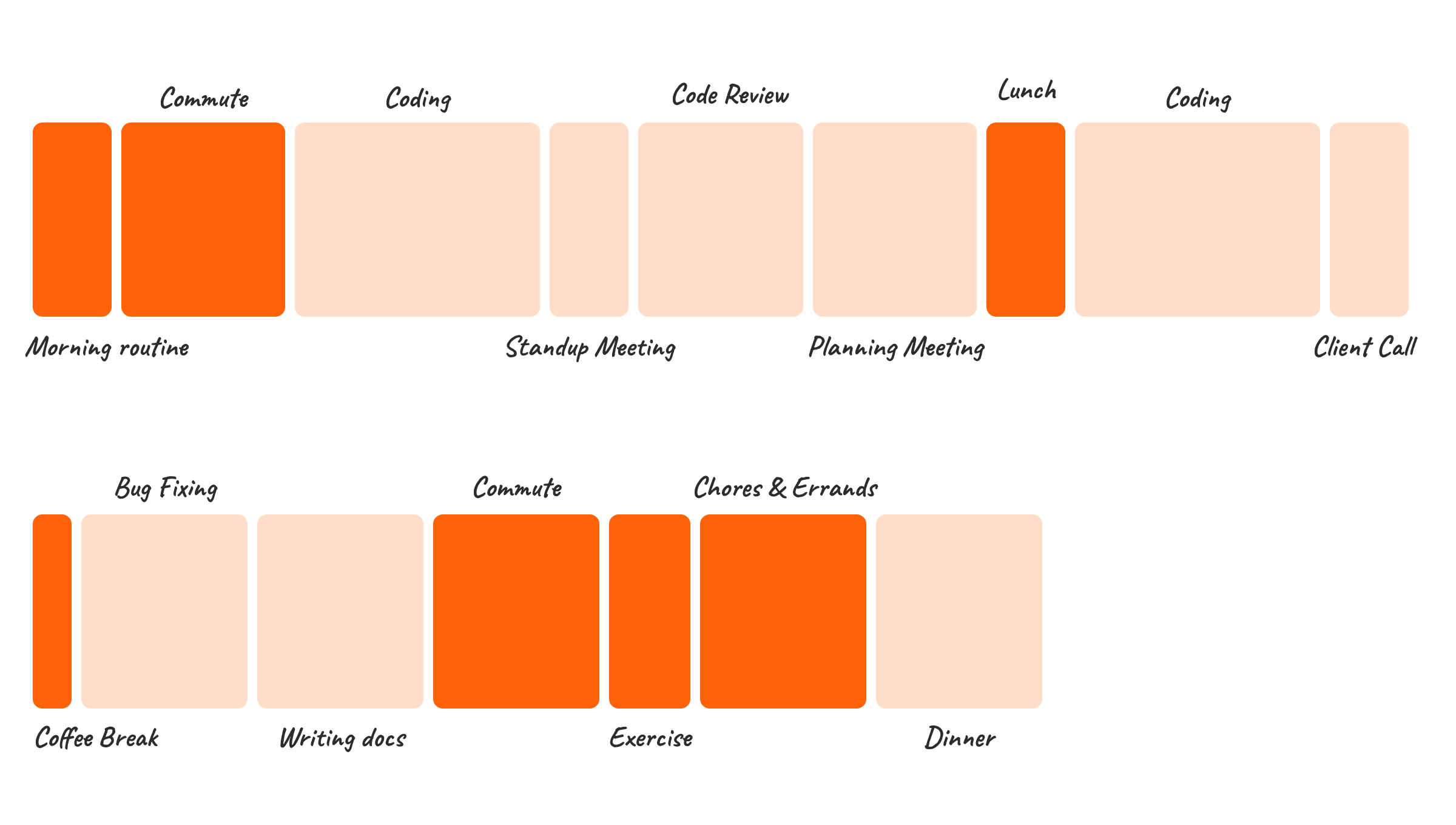
I’ve been tracking my time since 2015. I started doing it mostly as a productivity experiment. Over the years, analysing this data revealed a flaw in my thinking about productivity: the real constraint is not time, but the infrastructure to use it effectively.
Let’s look at the “reading list” as an example. For years, my “read later” list has been a source of low-grade anxiety. You probably know the feeling. It’s that ever-growing collection of articles, essays, and newsletters that I’m excited to read, but somehow never get to. My immediate reaction was that I “lacked time” for it.
But the data told a different story. The time was there, hidden in plain sight while commuting, running, doing chores. The real issue wasn’t the clock. I lacked the tools to use my time effectively. The infrastructure I was using for learning (my eyes and laptop’s/phone’s screen) was unsuitable for the load I was putting on it.
Eyes are the new bottleneck for knowledge
Think about how our cities were originally designed. They were built for pedestrians. Streets were narrow, and everything was dense and walkable. When the car arrived, we tried to force it into this existing infrastructure. The result was chaos: congestion, noise, and inefficiency. The solution wasn’t better cars. It was entirely new infrastructure: railroads, highways, interchanges, and traffic management systems.
Today, our tools are like those old pedestrian cities. They were built with the assumption that you always have access to a screen. As a result, when the volume of information traffic grows exponentially, we end up with the same kind of chaos.
We spend all day navigating this screen-based world for work, and then we expect to navigate it for our own learning and development.
This is where the system breaks down. We are asking a legacy structure to handle a type of cognitive traffic they were never meant to carry 12 hours a day. Your mind might be eager to read through an exciting essay from a favourite author, but your eyes, the physical infrastructure for that data transfer, are at capacity. This is screen fatigue. It’s the traffic jam of the knowledge worker’s brain.
Why basic text-to-speech is a failed retrofit
If the visual channel is overloaded, the obvious alternative is audio. I’ve been a long-time Pocket user, and it offers basic text-to-speech. It’s a clear choice since I already have my articles saved there.
In practice, basic TTS felt like trying to fix a traffic jam by adding a new lane painted blue to an overcrowded highway. It failed to solve the core problem. It funnelled raw text from the screen straight into my headphones, ignoring the structure and nuance that make the content meaningful in the first place.
Imagine listening to an article where:
- The hierarchy disappears: I’d drift from one big section to the next with zero cue that a transition had happened. Suddenly, I’m lost.
- Visuals are ignored: When a chart, screenshot, or a diagram pops up, basic TTS skips it or defaults to the
altdescription if it’s available, making the article incomprehensible without looking at the screen. - Code blocks make zero sense: And if there’s a code snippet? Forget it. The TTS annunciates every character. Understanding the code snippet at this level is impossible.
It was a poor listening experience. I get why so many people dismiss audio as a serious format for learning. Existing solutions treat the audio as a second-class citizen.
Designing the new audio-first infrastructure
Written content is designed for the eye, not the ear. Authors rely on implicit elements to convey an article’s structure. These elements work great visually but have no alternatives when converted to sound.
When I started building Katalog, the question wasn’t, “How to make text sound good?” It was, “If this article was originally created as an audio track, how would it communicate its structure and meaning?”. This led to a complete redesign of the information pipeline for written content:
- We should treat lists not as text, but as structure. Use subtle, non-intrusive sound cues to signal the start of a list item, preserving the hierarchy for the listener.
- We should treat images as context. Analyze them to describe what they convey, not just what they are. The listener gets the insight from the chart, not the fact that a chart exists.
- We should treat code as an idea. Instead of reading the syntax, summarize its purpose, delivering the “so what?” of the code block, which was the author’s original intent.
This is more than narration. It is a translation of visual grammar into an audio-first structure. It’s the information equivalent of building a high-speed rail system next to a congested city road.
Integrating the new system into your day
Once this new, efficient infrastructure is in place, you stop trying to “find time.” Instead, you start redirecting the existing flow of your day through it.
I found it especially powerful to turn mundane, everyday activities into learning opportunities. My commute, once a dead zone of passive listening, became a time for focused consumption. I didn’t add new blocks to my calendar. I upgraded the “in-between” moments that were already there. The habit formed naturally because the tool was designed to fit into my life, not the other way around.
Conclusion
For years, I thought my reading list was a time management problem. It wasn’t. It was an input quality problem.
By switching from a screen-based, visually fatiguing input to a high-quality, audio-first one, I was able to finally get through my backlog and stay on top of new information. The key was to stop worrying about finding more time and to start focusing on improving the quality of how I consume content.
So, the next time you save an article to read later, don’t ask yourself, “When will I have time to read this?” Instead, ask, “How can I consume this in a way that fits into the time I already have?”
If you’re curious to see Katalog in action you can try it out here.